History and evolution of modern technical analysis
Charts have been used to illustrate price movements for hundreds of years. Today technical analysis, the study of charts and indicators, is commonplace and used extensively by traders, analysts and investors.
Early 1600s – The world’s first National Lottery was created by Queen Elizabeth I to finance England’s new navy. It was immensely popular, and charts exist, which were created to predict the lottery price movements.
Late 1700s – Homma Munehisa, a rice merchant in Japan, traded in Osaka's Dojima Rice market during the Tokugawa Shogunate. He was extremely successful and became immensely rich. Some consider Munehisa to be the father of the candlestick chart.
1885-1900 – On Wall Street, Charles H. Dow was the first American to incorporate technical analysis into the markets. His index of industrial companies was created to visualise the collective changes within a given marketplace, A.K.A the Dow Jones Industrial Average. He introduced the concepts of trends, cycles, momentum, support, resistance, volume and investor psychology.
1935 – William D. Gann explained the importance of using angles to analyse markets in The Basis of My Forecasting Method, his Commodities Trading Course and Tunnel Through the Air. The mystical nature of his work has split opinions of modern technical analysts. Some consider him to be a self-promoting fraud, others a genius. No one denies his prodigious and original output.
1940 – Ralf Nelson Elliott created his Elliott Wave theory and published his work Nature's Law –The Secret of the Universe. His cycles technique was popularised by Frost & Prechter in their book Elliott Wave Principle in 1977.
1948 – Robert D. Edwards and John Magee publish the best known early publication on the subject, Technical Analysis of Stock Trends. This work is often referred to as the first in-depth publication on technical analysis. Identifying trends, patterns, and volume analysis are some of the topics covered in this book. This gave way to modern charting, and such notions as Head and Shoulders tops and bottoms, double tops and bottoms, triangles, support and resistance, and trend lines. It has had many editions and is still published today.
1969 – Sherman McClellen, along with his wife Marian, created the McClellan Oscillator and Summation Index. The oscillator is a market breadth indicator, which subtracts the number of declining issues from the number of advancing issues. This complex calculation was originally performed manually on a daily basis, before the advent of computers. Technical analysis began its move from the just a graph to include mathematical indicators plotted below or on the chart.
1970s – In the early 1970s, the Market Technicians Association & Society of Technical Analysts began holding meetings in New York City & London respectively. At the time, these were informal meetings for a handful of technical analysts. Ralph Acampora, John Brooks and John Greeley were the official founders of the CMT and Robin Griffiths, Philip Grey* and Trevor Neil, original board members in the UK are still practising professional technical analysts today. These two organisations contributed the acceptance to technical analysis in serious institutional market research.
*died 2021
1978 – J. Welles Wilder Jr. published New Concepts in Technical Trading Systems. This groundbreaking book introduced such indicators as the Relative Strength Index (RSI), Average Directional Movement (ADX and DMI), Parabolic SAR, Average True Range (ATR). These are still amongst the most used indicators today. Like McClellan’s oscillator, Wilder’s indicators were calculated by hand, with Wilder's formulas using daily worksheets. At this point, technical analysis moved from charts to charts and indicators and towards systematic analysis.
1980’s – Present – Over the next few decades, the advance of computers and technology speedily changed technical analysis and trading. There followed a golden age in technical indicators. Many of the indicators developed in these years became the bedrock of technical analysis to this day. Richard Arms developed the TRIN index, also known as the Arms Index, to detect overbought and oversold levels within the market. John A. Bollinger made his contribution to the field of technical analysis with his now popular Bollinger Bands. The Moving Average Convergence Divergence, or MACD, was invented by Gerald Appel in the 1970s. In 1986, Thomas Aspray added the divergence bar graph to the indicator, to anticipate MACD crossovers. Others of note are Tom DeMark for his TD Sequential and George Lane for the Stochastic Oscillator.
Modern technical analysis looks at trends, and places importance on price and repeating patterns in the market. Today's technical analysis is now a mainstream and popular form of market research that sits happily alongside fundamental analysis.
Tip: Considering the advancement in computing power and accessibility of data, it is surprising that little new technical analysis has become popular and established itself as a ‘must-have’ in the way the RSI, MACD, Stochastic have done. Whenever you add an indicator to a chart, you are riding on the shoulders of technical analysis giants of decades ago.
Support and Resistance defined
Demand and supply drive market prices. Technical analysts do not argue with this. Their view is that by using charts, they can identify where demand and supply are kicking in. Technical analysts use support and resistance to mean demand and supply. Technical analysts say a rising market moves up because rising support levels support it. Falling markets move down because declining resistance levels are pressing them. Seen graphically, patterns and trends are revealed to traders. They can use this knowledge to set up trades.
If the price of a currency falls, the demand for that currency may increase. That lower price level may bring in buyers, and they support the price. They have stopped the price falling because they have exerted demand. We see this on a chart when the price bounces at a level. The fall was stopped, and a price rise generated. The low of this ‘V’ shaped formation is the support point.
Defining the trend direction and power
Prices move in three directions. Up, down and sideways. People often assume that if the market has been going up strongly, the next move will be down. This assumption is not necessarily true; the following action may be sideways.
Sideways market moves are called congestions, consolidations or pauses. This price stagnation means that traders and investors execute their business at similar prices over some time: this commitment to similar prices causes a psychological commitment to this level. A breakout of this balance can be powerful.
Consolidations, where buyers and sellers are pushing and pulling as hard as possible, and both with equal force, causes a balance. Graphically, this balance can form the shape of a symmetrical triangle on a chart, with the resistance and support in the triangle at equal angles. As they push and pull the price moves towards the apex of the triangle. As time goes on, they continue to push and pull with equal force, but with lower volume as they have done all the business they need to do. The volume declines in the pattern. Then, it becomes easy for one party to start pushing or pulling with a stronger force, catching the other party wrong-footed and causing imbalance and a decisive breakout of the chart pattern.
If one party is pushing harder than the other, the pattern will not be symmetrical. The slope will be steeper on one side of the triangle. This shape tells the technical analyst who is dominant, the bulls or the bears within the chart pattern, and who is most likely to win when it completes, and there is a breakout. The more price volatility we see inside the triangle (the height of the triangle), the more violent the move following the breakout can be. If the triangle forms without much price difference between its high and low, then there has not been much tension as the bulls and bears did battle. The move following the breakout is likely to be muted. Technical analysts use this information to help them set Minimum Price Objectives.
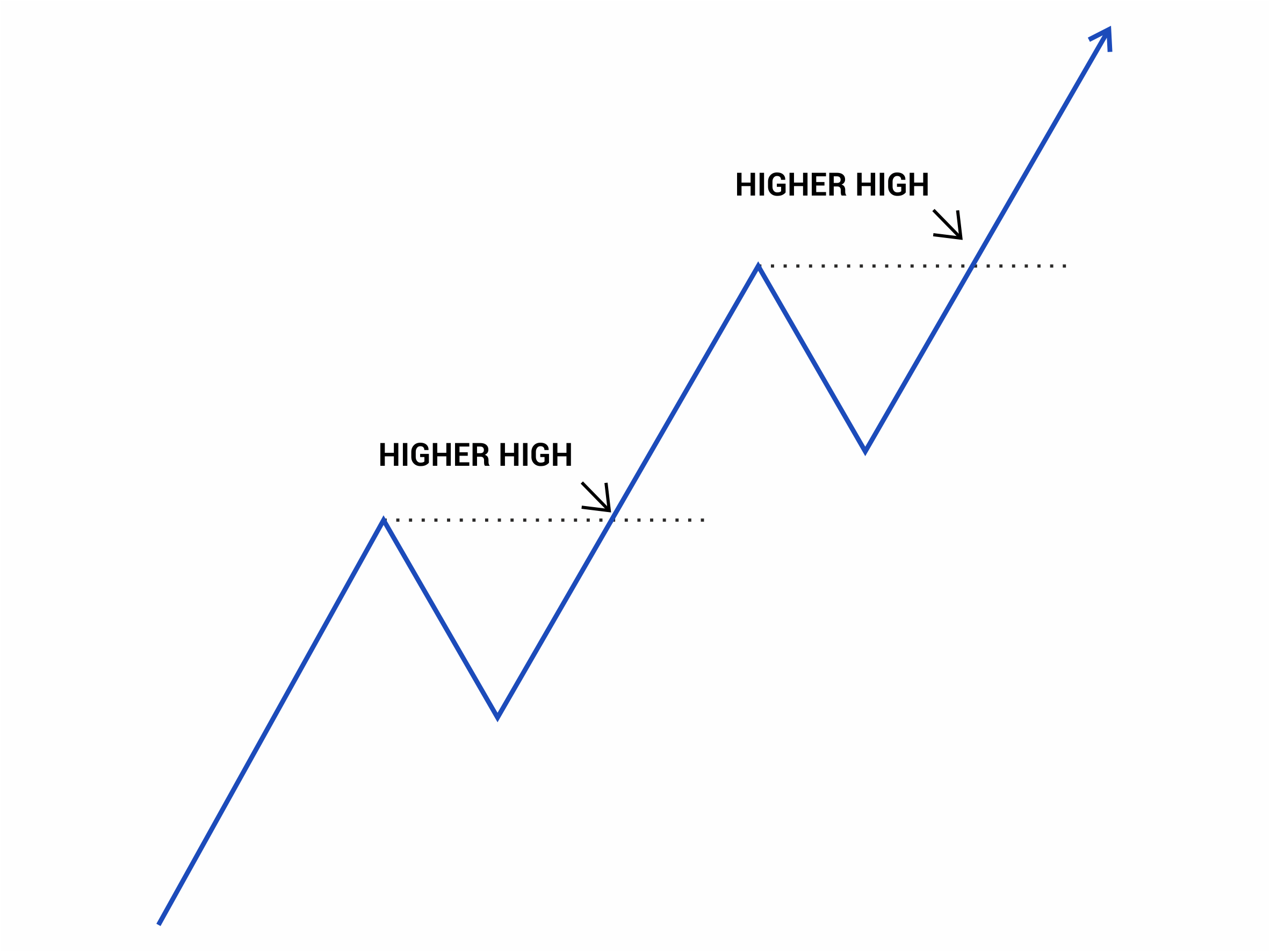 Figure 18
A rising bull market rarely climbs in a straight line. It is interrupted by moves against the trend as some traders take profits. Prices rise and fall in a zigzagging pattern. A rising trend is characterised by a pattern of higher highs and higher lows. A declining trend is defined by a pattern of lower highs and lower lows. As long as this pattern remains intact, we have a rising or falling trend.
With each new high, the low between this high and the previous high is the trend's defining level. If the price is above this, whether it is rising or falling, the uptrend is intact. Breaking this pullback low tells technical analysts that the trend which has been dominating the market is now complete. The news that has been driving prices is now not foremost in people's minds, and they are thinking about some other things.
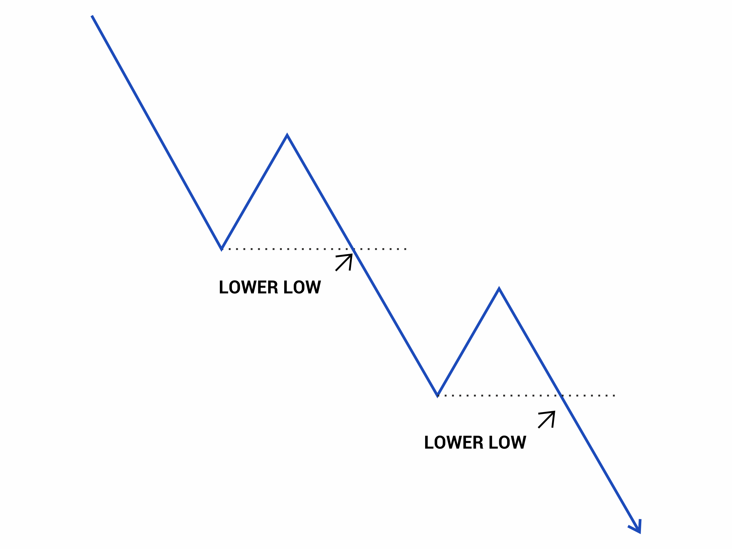 Figure 19
Likewise, on the way down the last and lowest pull back high is the defining level for an intact downtrend. As long as the series of lower highs is unbroken, then we are in a downtrend. The last lower high defines the exact price level, where the trend ends. The previous low is a support point in the downtrend. It may hold and form, for example, a double bottom chart formation. Or it may give way, and the trend is therefore intact and continuing. All this information is precious to technical traders. They will use it to make a trading plan for a trade.
Holding and breaking support and resistance levels
If bulls and bears are pushing and pulling hard, there is market balance if both exert equal pressure. This behaviour will form a chart pattern like a triangle or rectangle. After a while, the traders will have established all the positions they need, and interest will start to decline. This decline in pressure often displays a lower volume or turnover. Then it is easy for either the bulls or the bears to push the price up or down. The move may surprise the other party who scramble to cover their positions. If the move out of balance is, for example, upwards, it is a relief to the frustrated bulls as the market has refused to go up as they expected until now. Their response is often to buy confidently after the breakout. The combination of covering and relief buying can make the breakout move strong and impulsive.
This move-pause-move market behaviour repeats again and again in the market. The move could be up, then a pause, then up again. Or, the move could be up and a pause then down. We can have any combination with a pause in the middle. The pause can take the form of several chart patterns. If the pause marks a change in direction, the pattern of the pause is a reversal chart pattern. If the pause interrupts a move which continues in the same direction, the pause is a continuation chart pattern.
Understanding the message of charts
Patterns in the market participants’ reactions make shapes in the charts of prices. Because the same situations cause similar responses from participants, similar patterns form on the charts time after time. These patterns provide additional evidence to basic trend analysis and help identify when a trend will resume or change to a new trend direction. Chart patterns are also beneficial for traders when creating a trading plan.
Reversal patterns resolve themselves as a change in the market trend, and continuation patterns resolve themselves into a continuation of the existing trend.
We will discuss several patterns which occur frequently and can be seen often in the markets, defining their features, showing how to calculate objectives and the appropriate trading strategy for the pattern. We will also discuss the relative reliability of individual patterns.
Some chart patterns have a dual role – sometimes they are reversal patterns and other times continuation patterns.
Chart Patterns
Every trader should learn how to recognise and interpret chart patterns. This skill allows them to find profitable trading opportunities. The problem is that these patterns are subjective and evolve. A pattern may look like it will be something and then with more information, it becomes something else, perhaps with the opposite price implications. However, with practice, traders become better and better and correctly forecast the likely outcome.
Tip: determine what type of trading patterns suit you best. Some traders prefer reversal patterns. There is no more incredible feeling than catching and profiting from a top or bottom in the market. But catching the turns is the hardest thing of all. Although less glamorous, mastering trading of pauses can be more profitable and easier. Many chartists are happy to trade either reversals or continuations.
Each pattern has its characteristic. Some are more reliable than others. Some correctly forecast the move but not its direction.
Tip: Reading charts is a skill. The more you practise it, the better you'll become at it. You will be able to take advantage of the reality that markets repeat their behaviour.
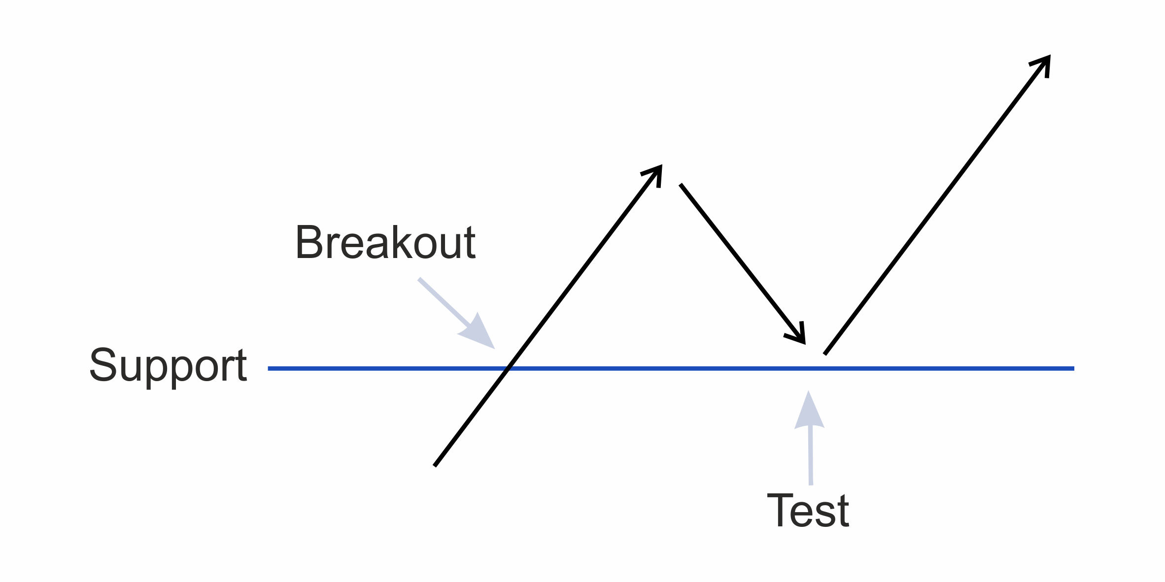 Figure 20
Tip: following a chart breakout of any kind but, particularly a decisive breakout, the market price will often pullback towards the breakpoint. We call this a retest. If the retest fails, you have got a perfect place to enter, but the problem is we don't always retest. Sometimes after the breakout, the price never looks back, and the price moves quickly towards its objective. Here is the risk: Play it safe and wait for a pullback but risk it not happening, and the market makes its move without you on board. It is up to you and your attitude to risk of missing the trade.
Continuation chart patterns
Most continuation patterns take the form of a Triangle, a Pennant, a Wedge or a Flag. The market also forms price channels. These can persist for surprisingly long periods and be surprisingly narrow.
Pennant, Wedge and Flag chart formations
A Wedge can be a continuation or a reversal chart pattern. Wedges look like Flags and Pennants, but Flags and Pennants tend to be only continuation patterns. Therefore Pennant, Wedge and Flags are continuation patterns, but a Wedge is sometimes a reversal pattern.
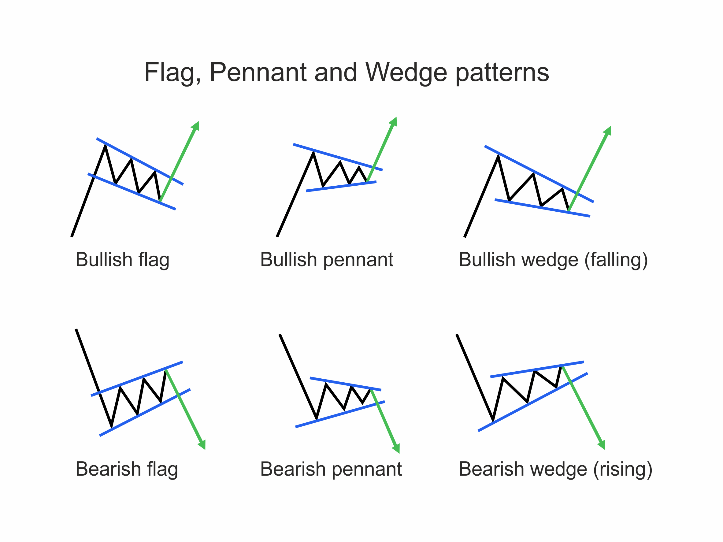 Figure 21
Flags, Pennants and Wedges are all continuation patterns that show a small pause or consolidation before resuming the previous trend. These patterns must always be preceded by a significant price rise or fall. Without the sharp initial advance or decline (flag pole) they're not continuation patterns. The Flag Pole is a necessary part of the pattern. Flags and Wedges slope against the trend, Pennants usually have no slope or only a mild one. A breakout of the pattern signals a trend continuation except for Wedges where the price may continue or reverse.
Ascending triangle
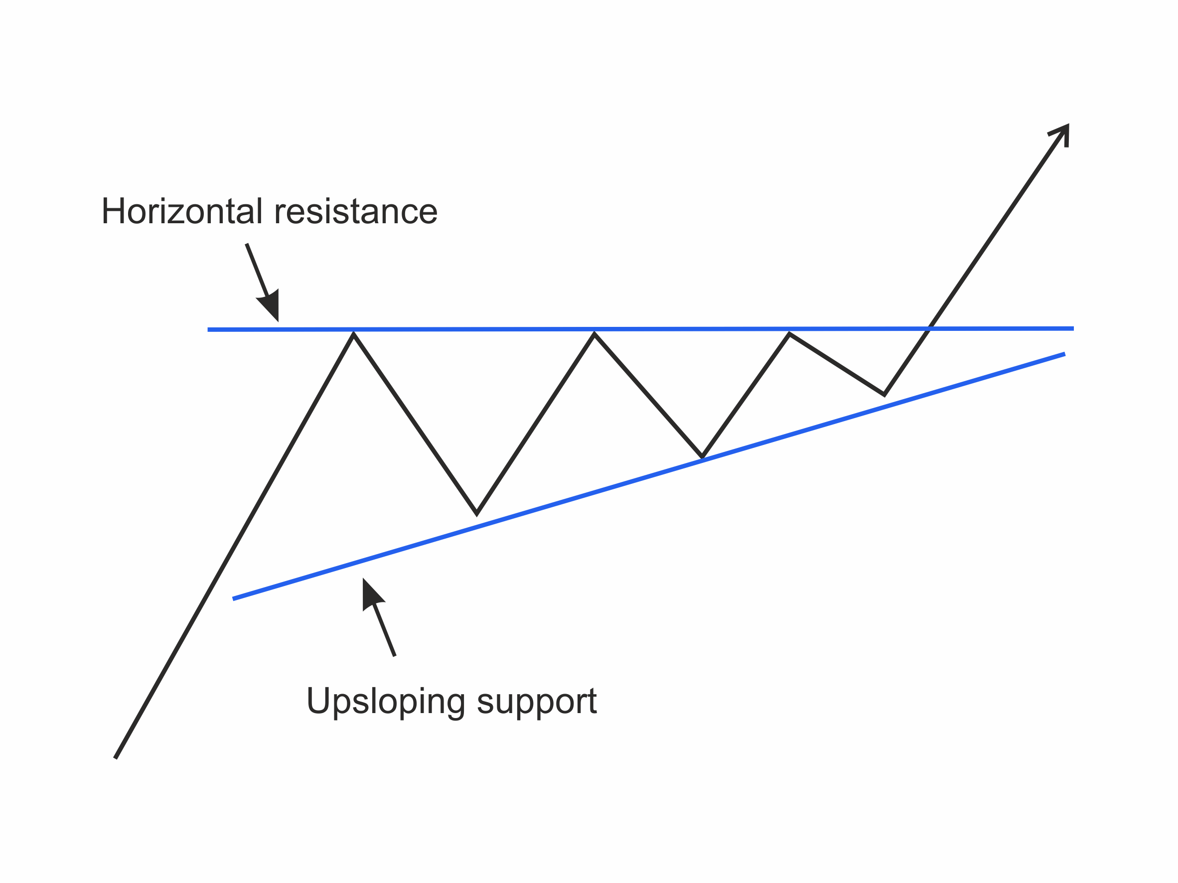 Figure 22
Ascending triangles are most often bullish and usually a continuation pattern in an uptrend. Sometimes they can be reversal patterns at the end of a downtrend, but they're usually accepted as continuation patterns. The pattern shows us that resistance is building up, pushing against a horizontal price level, as the bulls are getting stronger and forming higher lows. The rising support line and the horizontal resistance line should have at least five points on them before you have the confidence to label the pattern an ascending triangle. There could be three points on one side and two on the other or three on one side and three on the other but at least five pivot points in all. Otherwise, it is too risky to assume it is an ascending triangle as it may just as well be something else.
The volume also decreases while the triangle forms and should increase when the price breaks out.
Descending triangle
A descending triangle is usually a continuation pattern. A descending triangle is the opposite of an ascending triangle. A series of horizontal lows form a support level, and above it are declining highs as the sellers become more aggressive.
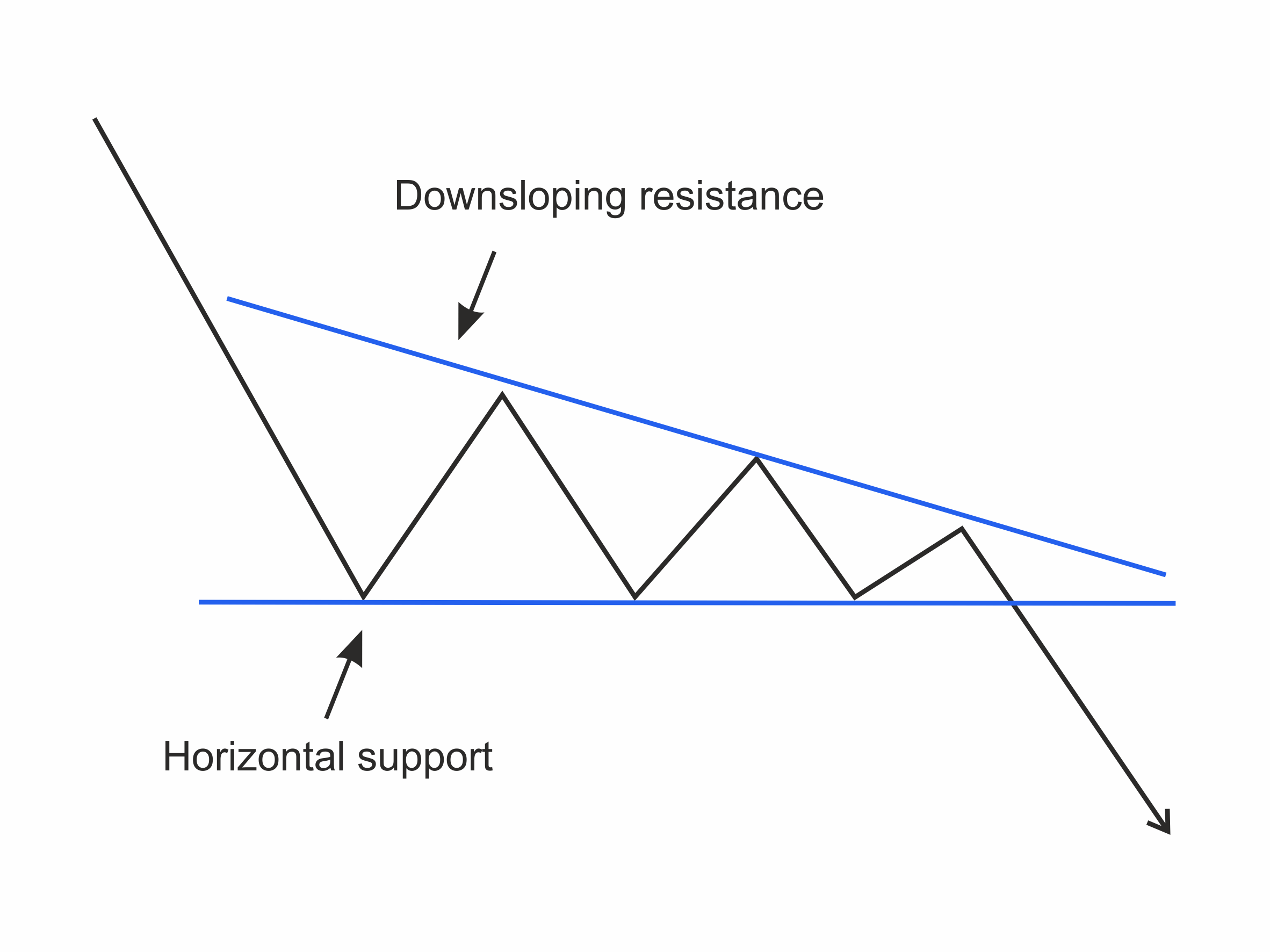 Figure 23
Again, expect to see the volume decrease as the pattern forms and increase sharply when the price breaks out.
Channels
A price channel looks like a sloping rectangle. It is a continuation pattern consisting of a higher trend line acting as a resistance and a lower trend line acting as support. Before confidently drawing a channel we need at least a total of five pivot points, two on one side and three on the other.
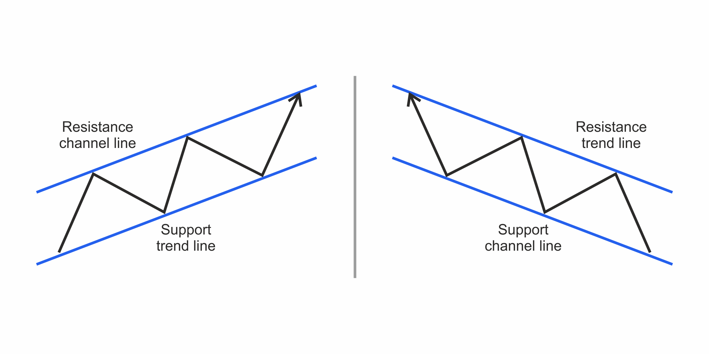 Figure 24
Declining price channels are considered bearish, and ascending price channels are considered bullish. In a downtrend, the resistance is the main trend line, and the parallel line along the declining support levels is called the lower channel line. The rising support line is the main line with the parallel rising line over the resistance, pointing the upper channel line in an uptrend. It is best if the main line is the one with at least three points on it.
The volume also often decreases when the channel is formed and should increase strongly as the price breaks out.
Reversal chart patterns
These are the patterns we often see following a trend indicating the trend is complete, and we are likely to reverse.
Tip: Trading against the trend is dangerous. Always be respectful of the trend's power and don't be too keen to be a hero.
Double and Triple Tops
A double top is a bearish reversal trend pattern following an uptrend. The pattern forms when the price makes two closely priced tops with a pullback in between. It looks like the letter ‘M’.The pattern is confirmed when the price breaks the low of the pullback.
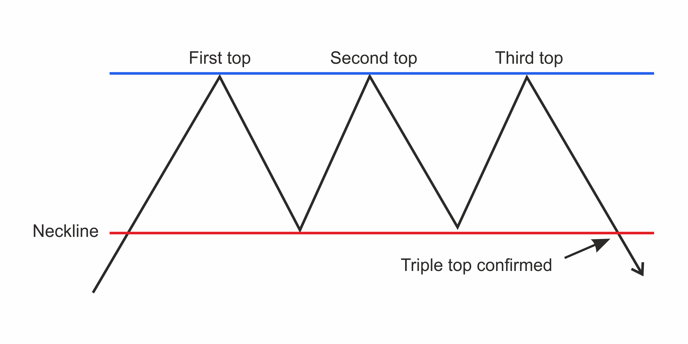 Figure 25
Tip: It is essential to wait for the pullback low to break because stopping at the same price twice more often is followed by a continuation move. If the market moves up, pulls back, rallies to the previous high, and then pulls back a bit, it will most often follow through in the same direction. We have now got an ascending triangle, continuation pattern, not the double top we were expecting. Be careful. Wait for the low between the two tops to be broken before being confident you have a double top in place.
Triple Top and Bottom
Less frequently, we get triple tops and triple bottoms. These are the same except they have three tops or bottoms instead of two. The rules and are the same.
Double Bottom
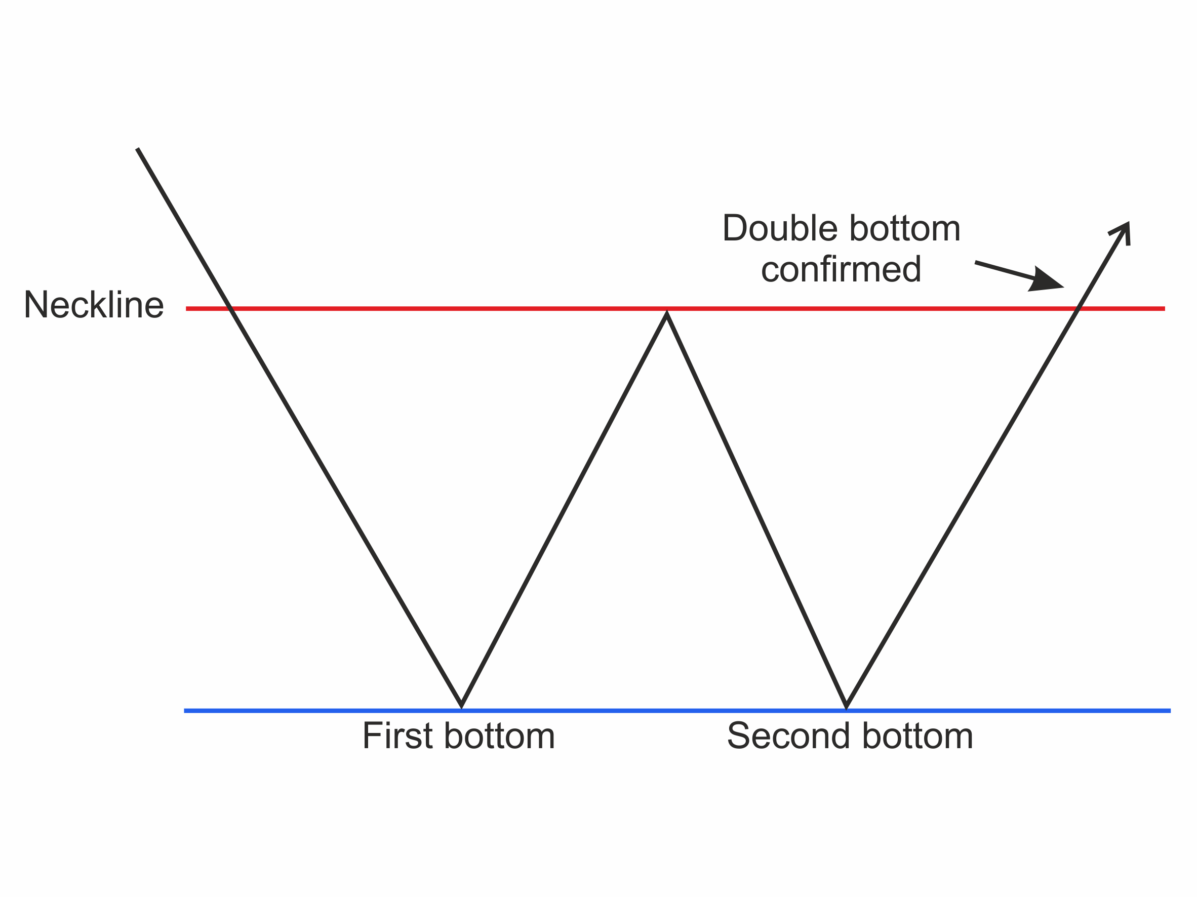 Figure 26
A double bottom following a downtrend is a bullish reversal pattern. The pattern is made up of two consecutive lows at roughly the same price with a pullback in-between. The chart pattern completes when the price breaks above the pullback high – and not before. The pullback high was previously resistance and once broken becomes support if there is a retest of the breakpoint. Look for a rising volume following the breakout to give confidence it will continue.
Head and Shoulders and Reverse Head and Shoulders
A properly formed Head and Shoulders chart pattern after an uptrend indicating the trend is over and reversing.
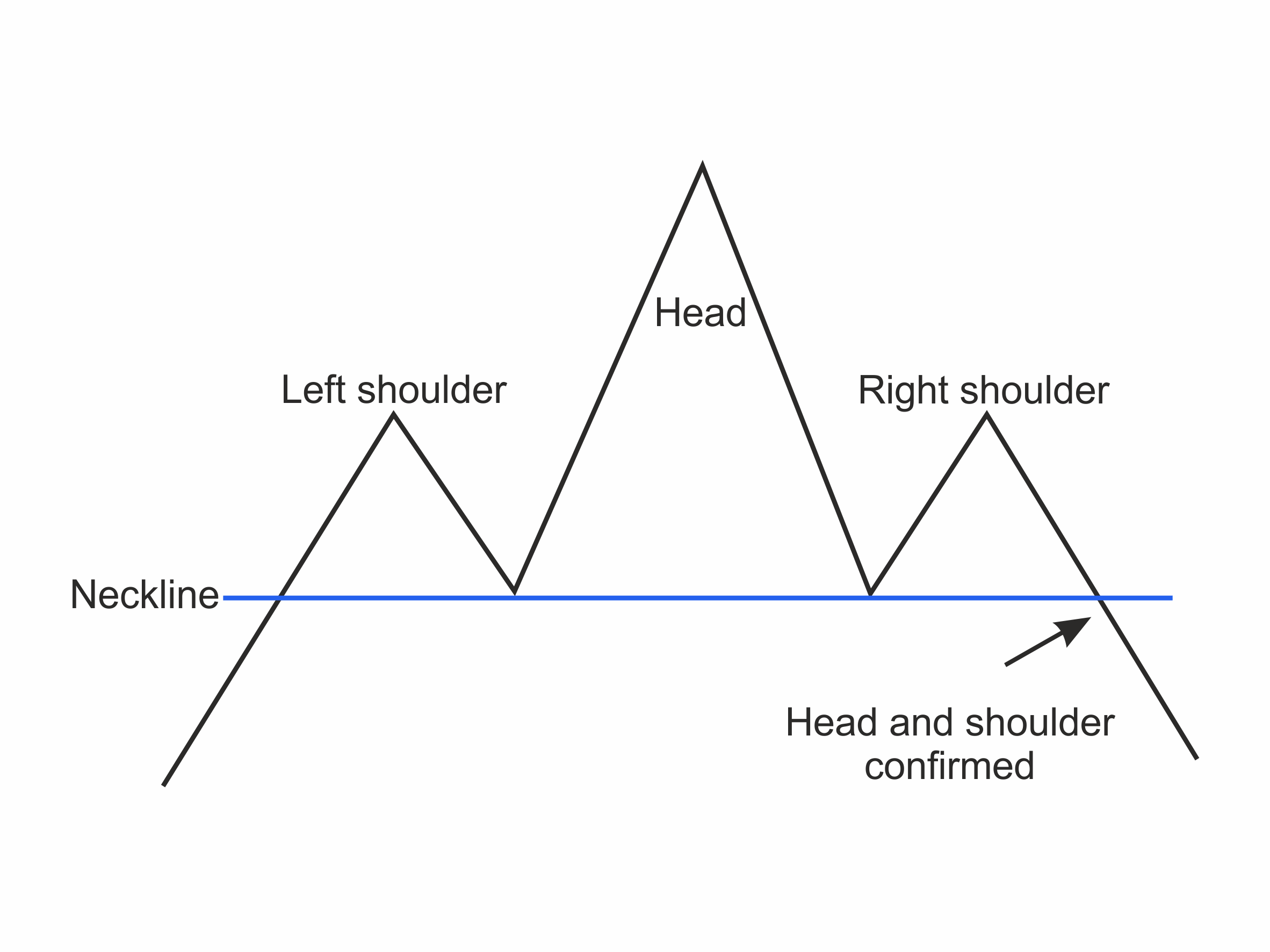 Figure 27
A Head and Shoulders Top has four parts: a trend preceding it, a high followed by a higher high and then a lower high. The first high is referred to as the Left Shoulder, the higher high, the Head and the lower High the Right Shoulder. Trading volume is often lighter on the Right Shoulder. The Neckline is drawn by joining the two pivot lows within the pattern. The Neckline points are formed by the low between the Left Shoulder and the Head, and the low between the Head and the Right Shoulder. These two pivot points are joined and extended to give the breakpoint to confirm the completed Head and Shoulders Pattern. Breaking the Neck Line is like breaking the neck of the bull run. It is over. We sometimes have a low volume pullback after the breakdown.
The slope of the neckline is an important indicator. If the neckline slopes down, bearishness is indicated as the price has already made a lower low before the right shoulder was formed. A rising neckline indicates a less bearish outcome, but a top none-the-less.
Tip: If the Head and the Right Shoulder volume are lower than the volume on the Left Shoulder, you can be confident this pattern indicates severe loss of upside momentum. Most likely, the Head and Shoulders will complete.
A reverse Head and Shoulder is the opposite pattern formed at a bottom following a downtrend. It has three lows as before, but this time it is low, lower low and higher low. The pattern completes with the break of its neckline, which is drawn in the same way.
Falling Wedge
A Falling Wedge consists of two downward-sloping trend lines forming a triangle. Since both the resistance and support lines decline while converging, their implication is bearish. The resistance and the support line converge as buyers and sellers push towards each other. The lower support line is shallower, indicating the lows are getting less low and downward momentum is decreasing. The falling resistance line has a steeper angle indicating the bears are more aggressive than the weak bulls.
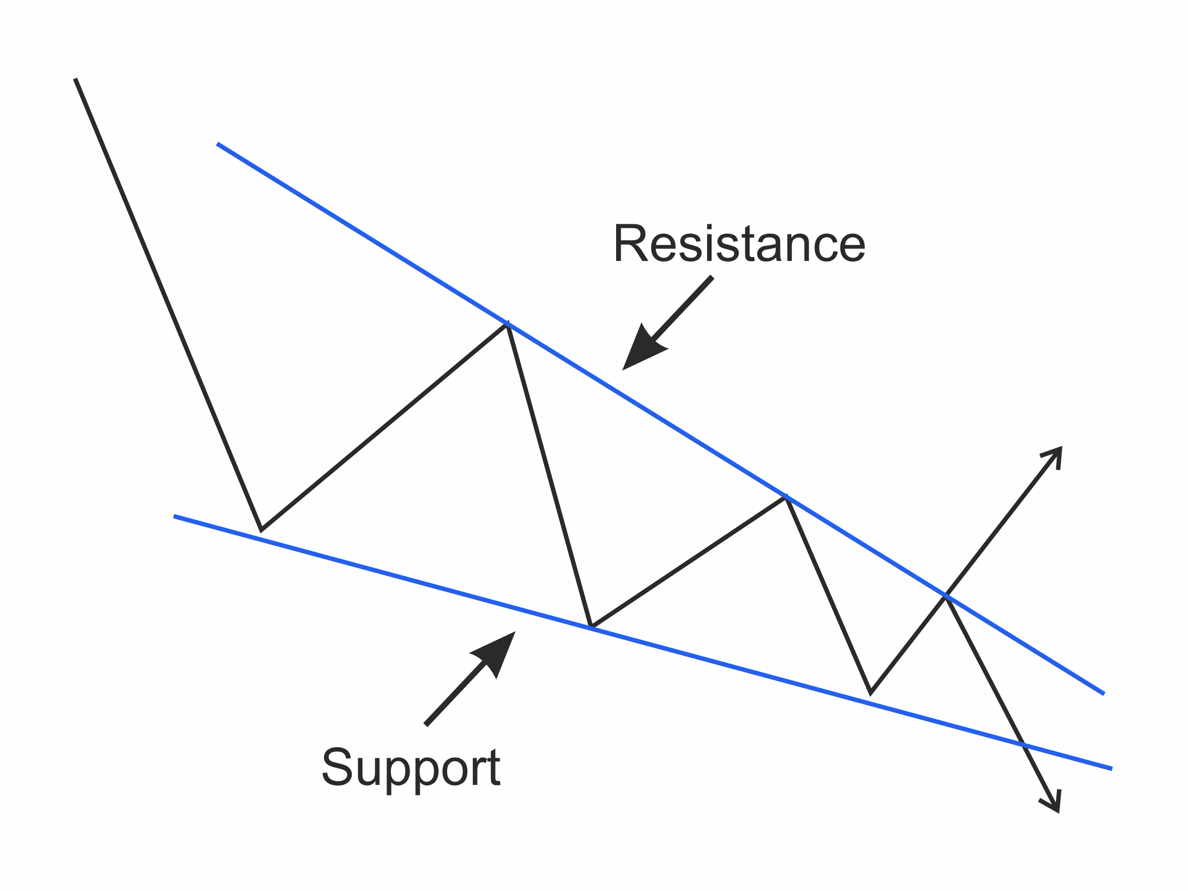 Figure 28
Tip: A Falling Wedge is a notoriously unreliable pattern. The price may break up or breakdown. The marginal odds are that it will be a break to the upside. For this reason, it is essential to wait until you have a clear breakout and then follow the break. Do not be impatient and try to predict the break.
Neutral chart patterns
Some patterns indicate impending moves but not the direction of the move. We classify these as neutral chart patterns.
Symmetrical triangle
This triangle follows a rise or fall in the prices and is distinguished by the declining resistance line’s angle being the same as the climbing support line’s angle. As the bulls and bears do battle inside the pattern, the fact that the top line's slope and the bottom lines are the same, tells us the bulls and the bears have the same strength. It is therefore impossible to predict who will win the battle.
As with all triangular patterns, there must be at least two pivot points on one side and three on the other. With two on one side and two on the other side, it is too early to conclude a triangle.
Tip: The difference between a Pennant and a Symmetrical Triangle is in essence, how long they take to form. The triangle needs two points on one side and three on the other. A Pennant can be formed in as few as three candles. It is the same shape as a symmetrical triangle but is formed in a short period of time. Don't forget a Symmetrical Triangle can break out either way but a Pennant is usually a continuation pattern.
Rectangle
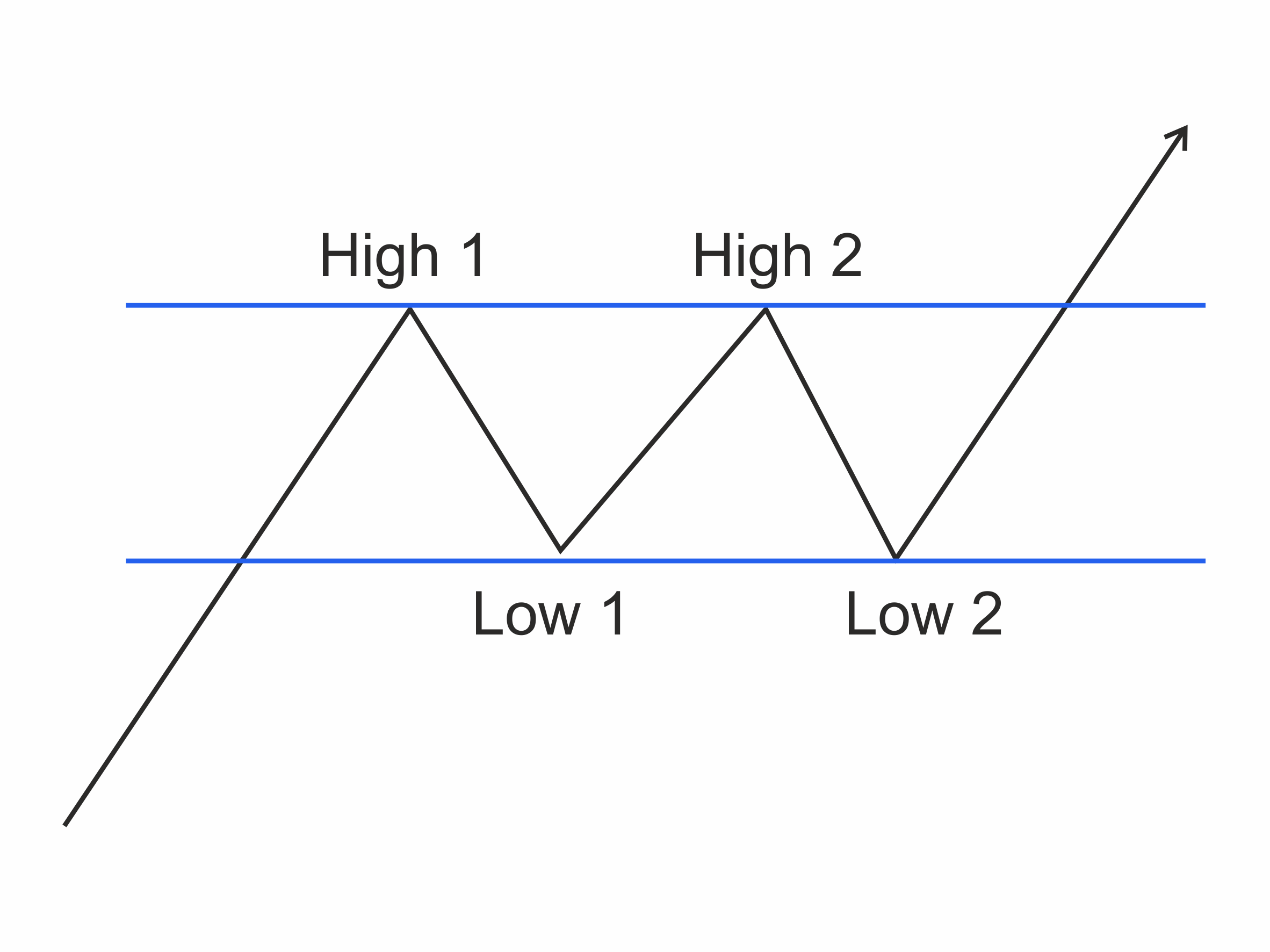 Figure 29
A Rectangle is a consolidation formed by the market trading up and down within a range. They are often called trading ranges. A Rectangle is a pause in the trend and often considered a continuation pattern. But very often it can be neutral. The Rectangle has an oblong shape formed by the buyers pushing the price up at the same support level and the sellers pushing the price down at the same resistance level. The boundaries of resistance and support form the Rectangle.
Fibonacci
Fibonacci was also called Leonardo Pisano or, in English, Leonardo of Pisa. He was born c. 1170 in Pisa (we assume) and died after 1240. In 1506 Perizolo, a Notary of the Holy Roman Empire, mentions Leonardo as Lionardo Fibonacci. He was a medieval mathematician who wrote Liber abaci (1202; ‘Book of the Abacus’), the first European work on Indian and Arabian mathematics. He later went to Egypt, Syria, Greece, Sicily, and Provence, where he studied different numerical systems and calculation methods. In Egypt he studied the geometry of the Great Pyramids in Giza.
The number series and ratios which bear his name were appreciated and studied over history by the ancient Egyptians, Leonardo da Vinci (Last Supper, Mona Lisa, Vitruvian Man), Gregor Mendel the monk (work on the patterns on nature) and many others including Steve Jobs (Apple logo, all dimensions in Apple products).
The Fibonacci Numbers
1, 1, 2, 3, 5, 8, 13, 21, 34, 55, 89, 144, 233, etc.
Each number in the sequence is the sum of the previous two numbers:
1 + 1 = 2,
1 + 2 = 3,
2 + 3 = 5, and so on….
The Golden Ratio
Progressing along the sequence, the ratio of each number to its preceding number approaches closer and closer to the golden ratio: approximately 1.618. The golden ratio, often represented by the Greek letter Φ (Phi), is calculated as:
( 1 + √ 5 ) / 2
Each number is also approximately 0.618 of its successor. This reciprocal number, known as φ (phi), is calculated as:
( √ 5 – 1 ) / 2
Where √ 5 is the square root of 5.
Fibonacci Golden Ratio and its Reciprocal
Each number divided by its predecessor approaches 1.618 Each number divided by its successor approaches 0.618
1/1 1.0 1/1 1.0
2/1 2.0 1/2 0.5
3/2 1.5 2/3 0.666…
5/3 1.666… 3/5 0.6
8/5 1.6 5/8 0.625
13/8 1.625 8/13 0.61538…
21/13 1.61538… 13/21 0.61905…
34/21 1.61905… 21/34 0.61765…
55/34 1.61765… 34/55 0.61818…
89/55 1.61818… 55/89 0.61798…
If you divide two adjacent numbers, the smaller by the larger, you get 0.618. If you jump over a number when dividing, you get 0.318. 0.618 and 0.382 are closely related to the Golden Ratio and derived from the Fibonacci sequence.
Fibonacci in Nature
Fibonacci numbers occur throughout nature: The arrangement of petals in most flowers, the arrangement of leaves on most plants, sea-shell spirals, the arrangement of seeds on sunflowers, pine cones and many other plant species.
While the Fibonacci number sequence may be prevalent in nature, it is not a universal law. There are many exceptions. But you never get a four-leaf clover.
Fibonacci Ratios
As well as the Fibonacci number series, traders also use the ratios in their analysis. These ratios are often expressed as percentages.
The four main ratios we plot on our charts are:
0.618 (or 61.8 per cent), the reciprocal of the golden ratio. One of the two most important;
0.50 (or 50 per cent) – the second number divided by the third (1 divided by 2);
0.382 (or 38.2 per cent) – the reciprocal of the golden ratio squared (i.e. 89 / 233). The other most important ratio;
0.236 (or 23.6 per cent) – the reciprocal of the golden ratio cubed (i.e. 55 / 233).
0.50 or 50% is a questionable Fibonacci ratio. 0.50 is not a Fibonacci ratio at all because it has no connection to the golden ratio. In practice markets often pull back half when they are in a trend.
Tip: the first line of support in a rally is the previous peak – which often equates to a 50% retracement.
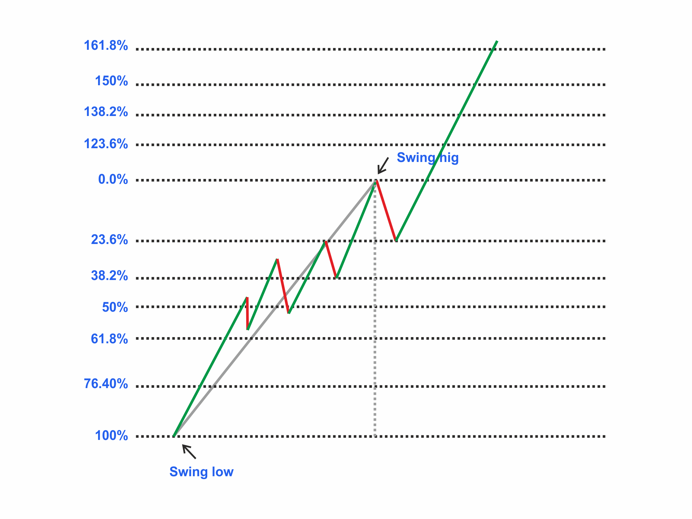 Figure 30 Inpulse, Reaction, Impulse in a Trend
Firstly the market must be in a trend. There is no reason for Fibonacci Retracements or extensions to work if there is no trend in place. When measuring an uptrend, the first point to identify is the first Swing Low – the point where the current move started, then the Swing High – the high so far. Retracements are measured from these two Swing Points. Likely support points are at the Fibonacci levels as long as this is a trend and it is going to hold.
Tip: If it is not in a trend, all levels will give way. The analysis was wrong as there was no trend.
The smaller the pull-back in relation to the trend (the longer the impulse move in relation to the action) the stronger the trend is and the higher we are likely to go as the trend reasserts itself.
Fibonacci Extensions
Traders often use Fibonacci Extensions to map likely future support or resistance levels after a pull-back is complete. As soon as the third points – the retracement – is identified, projections can be made of the next leg in the trend’s power. The longer the impulse move and the shorter the reaction relates to it, the stronger the next impulse is likely to be.
Moving Averages
Moving averages describe the direction of the trend by smoothing price data. They are typically calculated using closing prices of the time period – the hour, day, week etc.
Tip: Moving averages are calculated using the median, typical, weighted closing, and high, low or open prices as well as other descriptions of the action of the bar. In reality, the close is most straightforward and best, and other versions add little to the message.
Moving Average Periods
Moving averages with smaller samples are more sensitive and identify new trends earlier and give more false alarms. These are referred to as Short Moving Averages. Moving averages with larger samples, called ‘Long MA’, are more reliable but less responsive, only picking up the significant trends. Short Moving Averages react quickly to changes in price direction but are often incorrect. They are prone to Whipsaws.
Tip: Longer Moving Averages tend to be right more often but are late in recognising the change in the market's direction. There is no perfect sample for a moving average. It is just a compromise between timing and accuracy.
Tip: Use a moving average length that is half the length of the cycle that you are tracking. If the peak-to-peak cycle length is roughly 20 days, then a 10-day moving average is appropriate. Some traders, however, favour the Fibonacci numbers of 5, 8, 13 and 21.
Popular Moving Average Lengths
We know there are no correct lengths for moving averages, but we can use them to define our long-, intermediate- and short-term view.
100 to 200 Day (20 to 40 Week) moving averages are popular for long-term cycles;
20 to 65 Day ( 4 to 13 Week) moving averages are useful for intermediate-term cycles;
5 to 20 Days for short-term cycles.
Different market participants have different perspectives and therefore, personal definitions of their views. But all market participants from Day Traders to Long-Term Investors have short-, intermediate- and long-term views that are proportionally the same.
Tip: Short-term traders like Day-Traders can substitute a shorter period which is relevant to them. For example 100-200 10-minute moving average. For a day trader, this is their long-term goal. A long-term trader might use 100 to 200 Week period (two to four year) to show them their very long perspective.
Price crossing the Average Signal
The most straightforward moving average system generates signals when price crosses the moving average:
Go long when price crosses to above the moving average from below.
Go short when price crosses to below the moving average from above.
This method is prone to whipsaws in ranging markets, with price crossing above and below the moving average, generating many expensive and disheartening false signals. For that reason, moving average systems use multiple average rules and filters.
Multiple moving averages and Filters
To reduce whipsaw, traders use multiple moving averages and/or trade trigger signals.
Two Moving Averages uses a shorter moving average as a substitute for a closing price, substantially reducing cross overs (whipsaws).
Three Moving Averages employs a third moving average to identify when the price is ranging. This gives a three-stage message: long, short and square of the market. When the market is moving sideways, a three moving average trader has no position or market risk. As soon as a market moves up or down, they get long or short and then square off again as the move ends.
Multiple Moving Averages use a series of (say) six short moving averages and six longer averages to confirm each other. This can be used to build and manage positions in stages. This style is sometimes called Rainbow Moving Averages reflecting the different colours of the averages on the chart.
Displaced Moving Averages are useful for trend-following purposes, again reducing the number of whipsaws.
The popular MACD (Moving Average Convergence Divergence) indicator represents the two moving average system, plotted as an oscillator that subtracts the short moving average from the longer moving average. (See below)
Moving Average Calculations
There are many ways to calculate moving averages, but there are mostly just three calculation methods used in technical analysis.
Simple moving averages are the easiest to construct. They give equal weight to each data point and, therefore, are least sensitive and are late giving a message when the market changes direction.
Weighted moving averages give weight to the most recent data points. As a result, they are closer to the price and react quite sensitively when the price direction changes.
Exponential moving averages achieve the benefits of weighting combined with ease of construction. They are popular in technical analysis, especially when there is averaging within the formula of an oscillator.
J. Welles Wilder used his own calculation for moving averages within his popular indicators such as the Relative Strength Index. Wilder Moving Averages have nearly the same formula as exponential moving averages; they use slightly different weightings. For practical purposes, they are the same as exponential moving averages.
Oscillators
Below the chart, technical analysts plot Oscillators. Oscillators can be used on their own or to support the message of the charts above. Some Oscillators are indexed (such as RSI and Stochastic), and some are not (such a MACD and Momentum Oscillator). They measure two aspects of the market action: Direction and Momentum. All Oscillators have the same most important message – the message of Divergence. We see Divergence when the action of the price deviates from the action of the Oscillator. This can happen at the end of trends. They have their own trade triggers too. Many traders use Oscillators. Sometimes traders even use them in isolation of other technical analysis. For them, the Oscillator is enough to give timely trading signals.
Divergence
The message of Divergence is common to all Oscillators. Oscillators tend to imitate the peaks and troughs on the price chart with a series of similar highs and lows. Divergence occurs when the indicator fails to mimic the price chart's action, a sign of trend weakness and possible reversal. The message of price and Oscillator disagree. Convergence is when the series of similar highs or lows are also reflected in the price action. The message of Oscillator and price agrees.
In an up-trend, if the price makes a new High (a higher high than the last one) but the indicator fails to do so, that is a bearish divergence.
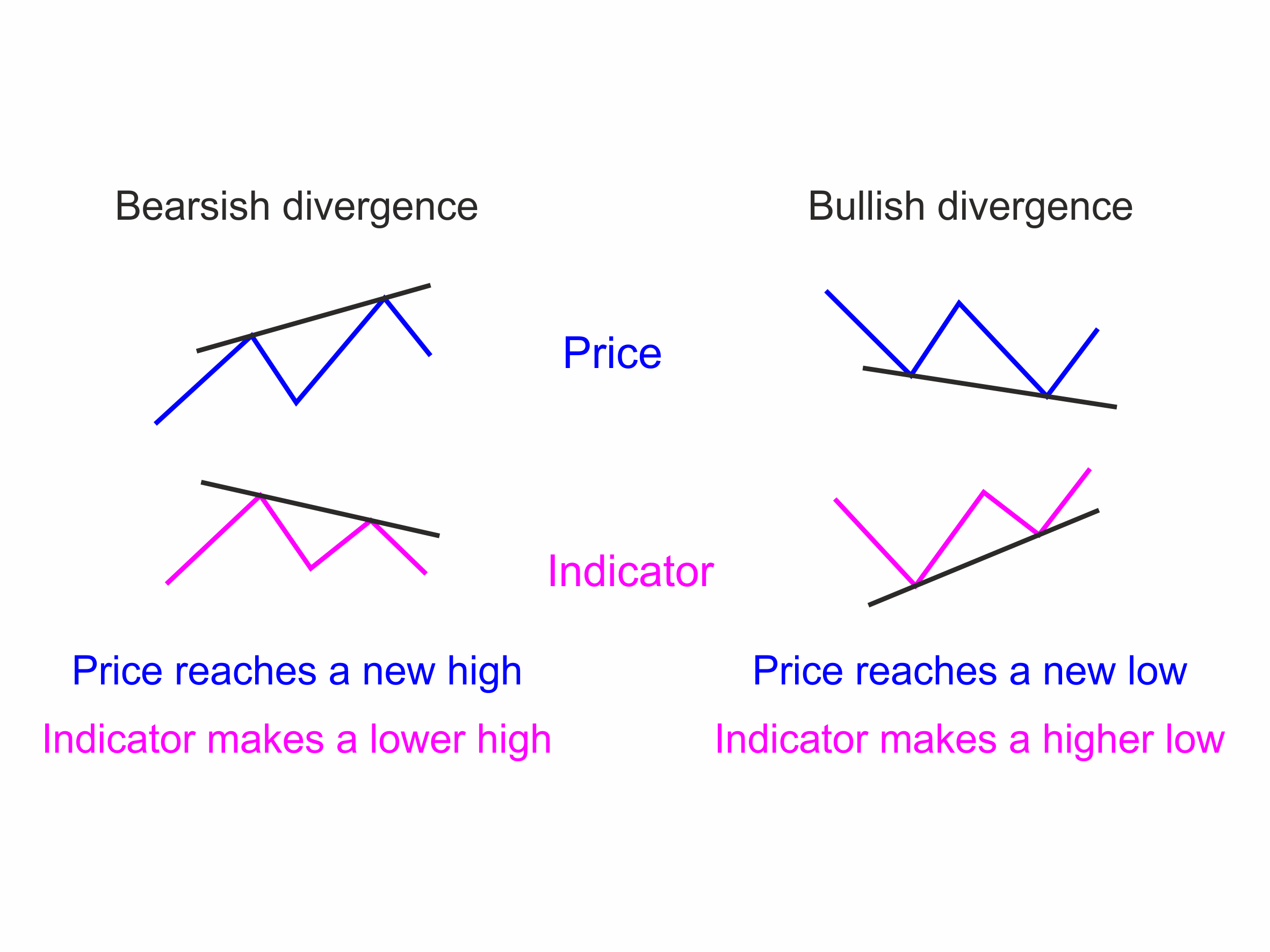 Figure 31
If the price makes a new low (a lower low than the last), but the indicator does not, we have bullish divergence message in a down-trend.
Tip: Not all Divergence results in a market top or bottom and a change in price trend. Unfortunately, also, not all tops and bottoms have divergences. But the message of slowing up which accompany tops and bottoms frequently occur at tops and bottoms.
Tip: Unless supported by other indicators, ignore weaker divergences where:
The price makes a matching top (a double top), and the indicator makes a lower top or price makes a matching bottom (a double bottom), and the indicator makes a higher bottom.
The price reaches a new top, and the indicator makes an equal top or the price reaches a new bottom, and the indicator makes a matching bottom.
Tops or bottoms are only marginally different in height. Divergences should be clear.
Remember, trading off Divergences should be done with extreme caution. You are going against the trend – a dangerous trading strategy to contemplate.
Popular Indicators and Oscillators
The terms Indicator and Oscillator are somewhat interchangeable. Traders use one when they mean the other.
There are several essential Oscillators all traders much know. There are many many more, but the differences and advantages are slight. Much time and energy are expended by traders trying to find the perfect Oscillator. There isn't one. They are all a compromise between timing and accuracy. Some have great timing, but that comes at the cost of accuracy. They catch the market turns but often give a wrong message. Some Oscillators have an excellent record of getting the message right. But this always comes at the cost of timing. We know which way the market is going once it has started.
With this in mind, we will look at several popular Oscillators and their use and characteristics.
Relative Strength Index
J. Welles Wilder’s Relative Strength Index (RSI) is a popular momentum indicator. The RSI was first revealed in his influential book New Concepts in Technical Trading Systems. It is today’s most popular oscillator.
The RSI compares upward movements in closing price to downward movements over a selected period. Wilder used 14 periods (for example 14 10-minute periods, 14 days or 14 weeks etc), but experienced traders commonly choose shorter periods such as 7 and 9.
The RSI is popular as it has several advantages over simpler calculations. The RSI has some smoothing, making its message easier to read than raw Momentum or Rate of Change Oscillators. It is also not as susceptible to distortion from unusually high or low prices at the window's start. It is indexed, so it fluctuates between 0 and 100, enabling fixed Overbought and Oversold levels. We can say a reading of over 80% is high as the RSI is normalised. It gives more timely signals than when an Oscillator crosses a zero line.
Tip: Remember, all Oscillators give good Divergence messages.
RSI Trading Signals
Traders have different ways to interpret and trade using the RSI. Most realise different signals should be used in trending and ranging markets. The best trading signals (apart from bullish or bearish Divergence message) are generated in the overbought and oversold zones. The actual entry of a trade following an RSI signal is often triggered using a Stop to enter or a Candlestick pattern to confirm the signal. RSI trade exits are usually generated using a trailing stop rather than waiting for an RSI signal in the opposite direction.
In Ranging Markets
When prices are ranging, the RSI often oscillates from Overbought to Oversold. Extreme reading in the RSI indicates price zones to act and go against the weak short-term trend.
Set the Overbought level at 65 or 70 and Oversold at 30 or 46.
Go long when RSI falls below the Oversold level and rises back above it or on a bullish divergence where the first trough is in the Oversold zone.
Go short when RSI rises above the Overbought zone and falls back below it or on a bearish divergence where the first peak is in the Overbought zone.
In Trending Markets
In up-trending conditions, it is unlikely the market will reach the Oversold zone. For this reason, traders will redefine it to be 40 or 50% according to their preferences. Being anywhere in the lower half of the RSI range is often as oversold as any bull market will get. The RSI is susceptible to giving sell message in a rising market. Only take RSI signals in the direction of the trend and ignore those against the trend.
Go long, in an up-trend, when RSI falls below 40 or 50 and rises back above it.
Go short, in a down-trend, when RSI rises above 50 or 60 and falls back below it.
Exit using a trend indicator and not waiting for the RSI or take profits on bullish or bearish divergences as the trend may be over.
Failure Swing
J. Welles Wilder, in his original book, only gave one example of a trading signal for the RSI. He made it clear there were more, and the Failure Swing was just an example. Not every market turn is marked with a Failure Swing, but this is how to use it when it occurs. Failure Signals are used as a signal for other oscillators too. They are very useful when they occur.
Failure swings, in overbought or oversold zones, signal that a trend is over and is reversing short-term. It is a short-term trading signal likely to move out of the overbought or oversold zone.
Failure Swing Defined
A Failure Swing Buy signal is defined as follows:
- A lower low (LL) in the oversold zone,
- Followed by an intervening peak that does not reach the overbought zone,
- Then a higher low (HL) in or out of the oversold zone.
- The failure swing completes and gives its signal the RSI breaks up though the intervening trough.
A Failure Swing Sell signal is defined as follows:
- A higher high (HH) in the overbought zone level,
- Followed by an intervening trough that does not reach the oversold zone level,
- Then a lower high (LH) in or out of the overbought zone.
- The failure swing completes and gives its signal the RSI breaks down through the intervening peak.
Tip: This pattern of highs and lows is identical to a trend reversal on a price chart.
The Failure Swing signal is strongest when the second peak (or trough) is also above the Overbought zone (below the Oversold zone), though this is not essential for a valid failure swing.
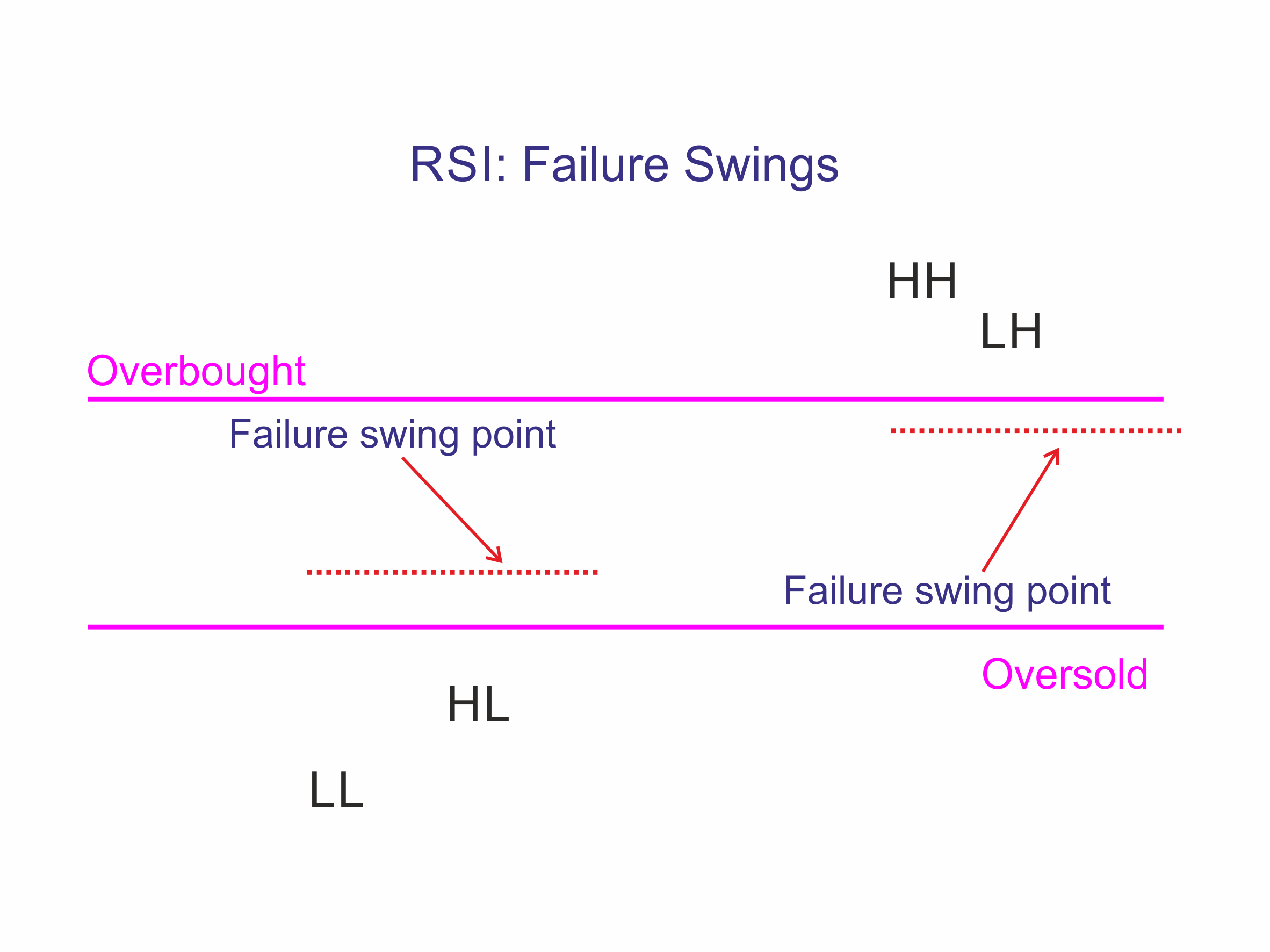 Figure 32
Stochastic Oscillators
There are two versions of the Stochastic Oscillator, the Fast- and Slow-Stochastic. Most traders prefer the Slow Stochastic as it gives clearer and more reliable signals. The Stochastic Oscillators are one of the most popular momentum oscillators in use today, particularly for short-term trading.
The Fast and Slow Stochastics consist of two lines:
- %K compares the latest smoothed closing price to the recent trading range.
- %D is a signal line calculated by smoothing %K.
George Lane, the Stochastic Oscillator’s inventor, did not give default parameters for the Stochastic. He used different values depending on the market conditions and the trading objective. Vendors choose differing defaults. Here are popular defaults for you to try.
|
Purpose
|
%K Periods
|
Smoothing
|
%D Periods
|
Overbought Level
|
Oversold Level
|
Observations
|
|
Used with a trend filter
|
5-10
|
6
|
3
|
80%
|
20%
|
Frequent trades
|
|
Selective & Stand-alone system
|
10-21
|
6
|
3
|
65%
|
35%
|
Focus on important price turns
|
Tip: Slow Stochastic incorporates a further smoothing and tends to give more reliable signals. The Fast Stochastic is too fast for almost everyone.
Stochastic Signals
Tip: As with the parameters above, these signals are suggestions only, and you must experiment and decide for yourself what is most suited to you. No one is the same, and of course, nothing works all the time.
In Ranging Markets
These are three different signals in order of desirability.
Long Signals
- Go long on bullish divergence (on %D line) where the first low is in the Oversold zone.
- Go long when %K or %D goes into the Oversold zone and out of it.
- Go long when %K crosses to above %D anywhere.
Short Signals
- Go short on bearish divergence (on %D line) where the first high is in the Overbought zone.
- Go short when %K or %D goes into the Overbought zone and out of it.
- Go short when %K crosses to below %D anywhere.
In Trending Markets
As with any method, traders want to strongly bias their strategy to the direction of the trend and resist fighting it. The trend IS your friend. Only take signals in the direction of the trend, and it is unwise to go long when Stochastic is overbought, nor short when oversold.
The shape of a Stochastic bottom gives some indication of the ensuing rally. A narrow bottom (a ‘V’ shape) that is not very deep indicates that bears are weak and that the subsequent rally should be strong. A broad, deep bottom signals that the bears are strong and that the rally could be weak.
The same applies to tops. Narrow Stochastic tops indicate that the bulls are weak and that the correction is likely to be sharp. High, wide tops show that the bulls are strong and the correction could be weak.
Use trailing buy- and sell-stops to enter trades and protect yourself with stop-losses.
Long Signals
If the Stochastic (%K or %D) falls into the Oversold zone, place a trailing buy long stop above the prior bar’s high. When executed, place a protective stop loss below the Low of the recent down-trend (the lowest Low since the signal day).
Short Signals
If Stochastic rises into the Overbought zone, place a trailing sell short stop. When executed, place a stop loss above the High of the recent up-trend (the highest High since the signal day).
Exit:
Use a moving average or a Divergence to exit.
Moving Average Convergence and Divergence
Moving average convergence divergence is usually called MAC-D or MACD. Gerald Appel developed it in his book, The Moving Average Convergence Divergence Trading Method in the 1970s. It is considered an oscillator, but it is not confined by a maximum or minimum and has no overbought or oversold zones like other oscillators. The MACD oscillates around a zero-based line.
The MACD is a trend-following momentum oscillator that shows the relationship between two exponential moving averages of a security’s price. Using the defaults, the MACD is calculated by subtracting the 26-period EMA from the 12-period EMA. This gives us the MACD line.
A 9-period EMA of the MACD is used as a trigger to show changes in direction. This is called the Signal Line. At its most simple, traders buy when the MACD crosses above signal line and sell when the MACD crosses below the signal line. The MACD crossing the signal lines shows the widening and narrowing of the gap between the 12- and 26-period moving averages. Widening gaps indicate stronger trends and narrowing gaps indicate weakening trends.
MACD in Trendless Markets
One check which indicates the presence or absence of a trend is the MACD flat and around the zero line. This means the two moving averages are staying close together. This is caused by trendless trading. The MACD/Signals crossover signals will be unreliable and prone to whipsaws in these conditions.
MACD in Trending Markets
When the MACD is away from the zero line, the market is trending. The further away the MACD is from zero, the trendier the market. In these conditions, MACD/Signal crossover signals will work well.
Tip: The MACD is a trend following technique for it to work well; there must be a trend.
When the MACD is positive and above zero, we are in a strong uptrend. When the MACD is positive but below zero we are likely reacting within a downtrend.
Other popular oscillators
There are many indicators and oscillators; in fact, hundreds. Mostly they are very close to the few very popular ones and add nothing to them. Generally speaking, oscillators are popular because people like them. They like them because they make them money. Popularity is a good guide to profitable oscillators. This guide is not intended to be a comprehensive guide to all techniques and oscillators. But we have covered here the most popular and probably all you’ll need. Complexity does not improve results.
Tip: Other oscillators which are worth exploring are: Commodity Channel Index, AROON, Parabolic SAR and Williams %R. But be wary of having too many oscillators and becoming confused. Keep your analysis simple.
Bollinger Bands
Bollinger bands are a popular technical analysis tool for plotting lines which are two standard deviations away from a simple moving average. They were developed by John Bollinger to find opportunities when a security is overbought or oversold.
Bollinger Bands Formula
Bollinger Bands are plotted around a simple moving average. John Bollinger recommended a period of 20 for the moving average – the number of trading days in a month. He uses Standard Deviations to measure how spread out the prices are from the average value. Standard Deviation is calculated by taking the square root of the variance, which itself is the average of the squared differences of the mean. Multiply that standard deviation value by two and both add and subtract that amount from each point along the moving average. This gives us the upper and lower Bollinger Bands.
BOLU=MA(TP,n)+m∗σ[TP,n]
BOLD=MA(TP,n)−m∗σ[TP,n]
where:
BOLU=Upper Bollinger Band
BOLD=Lower Bollinger Band
MA=Moving average
TP (typical price)=(High+Low+Close)÷3
n=Number of days in smoothing period (typically 20)
m=Number of standard deviations (typically 2)
σ[TP,n]=Standard Deviation over last n periods of TP
What are Bollinger Bands Saying?
Because standard deviation is a measure of volatility, when the markets become more volatile the bands expand; during less volatile periods, the bands contract. When the gap between the bands decline sharply, we are in a condition called a Bollinger Band Squeeze. The squeeze must be an obvious sudden contraction of the bands indicated a sharp drop in volatility (as opposed to simply a decline in volatility.) These squeezes often predict a breakout move in the price. Note though they only tell you the break is imminent, not its direction.
How to use Bollinger Bands
The most popular way of trading is using the Bollinger band squeeze. Traders will often follow the breakout out of the bands after the squeeze.
Ranging Market
A move that starts at one band often carries through to the opposite band in a ranging market. This will only happen if the market is moving absolutely sideways. With just the slightest uptrend or downtrend, the price may hit one band consecutively without hitting the other.
When the price stays outside the band, great strength or weakness is indicated. The ability to ‘hug’ the band is a sign of power in the move.
Breakouts and Reversals
A move outside the band indicates that the trend is strong and likely to continue. If price quickly reverses, however, a move to the opposite band is possible.
Trends
A trend that hugs one band signals a strong trend that is likely to continue. Traders often wait for divergence on a momentum Indicator (such a Divergence in the RSI) to warn that the trend is close to its end. They then resume trading band to band.
Tip: When trading using Bollinger Bands, you can close your trade at the moving average, rather than require the price to move from one band to the other. While this halves the profit, the number of times you will hit this target will be proportionally much larger. In the longer term accepting a smaller profit will pay off.
Tip: The reason Bollinger Bands are most popular amongst Day Traders is that there is much sideways oscillation during the trading day, allowing Bollinger Bands to catch and profit from short-term overbought oversold conditions. There are better ways to trade for longer-term traders.
Candlestick charting
History
In the 16th century, the country we now call Japan did not have a currency. It was a feudal federation. Citizens used to exchange commodities. People were paid in rice, and tax was paid in rice or grains. At the port and exchanges, feudal Lords set up a store for rice and grains; receipts were issued for rice deposits, and these certificates were currency. People used certificates of deposit as money. Additional certificates were generated for people to transact which they would be paid for in the future when the harvest was in. They were referred to as Empty Rice Contracts as there were no physical commodities to back them. They were promises to deliver physical commodities. These were the world’s first futures contracts.
Homma Munehisa
In the late 17th century a rice trader Homma Munehisa wrote down the rules for trading using candlesticks. This document was named after the town he came from, the Sakata Constitution. He was a very successful trader on the Osaka exchange. Reportedly he had won more than 100 consecutive trades in a row and was a legendary rice trader during his lifetime. He was even made an honorary Samurai for his contribution to technical trading. In 1775 he wrote a book code San-en Kinsen Hiroku. In this book, he highlighted how important it is to understand traders' psychological minds to be a successful trader yourself. He wrote that human emotions have a huge impact on prices.
Candlesticks Travel West
Candlestick charting was introduced to the West by Michael Feeny, who presented candlestick charting at the Society of Technical Analysts in London in the early ‘80’s. Steve Nison popularised them following a visit to a Japanese broker in the mid-‘80’s. His book, Japanese Candlestick Charting Techniques, was published in 1989 and is considered the subject's definitive work. From that day, traders converted from Point & Figure and Bar charts to Candlestick charts.
The Candlestick
As we mentioned in the opening chapters, a candlestick contains the same Open, High, Low and Close data as a normal bar chart but highlight the relationship between opening and closing prices using colour. The shadows show the range of prices traded during the period (high to low) while the body represents the period's opening and closing prices. If the close is higher than the open – the candlestick body is hollow or shaded – typically white, blue or green. If the open is higher than the close – the candlestick body is filled in or shaded red or black.
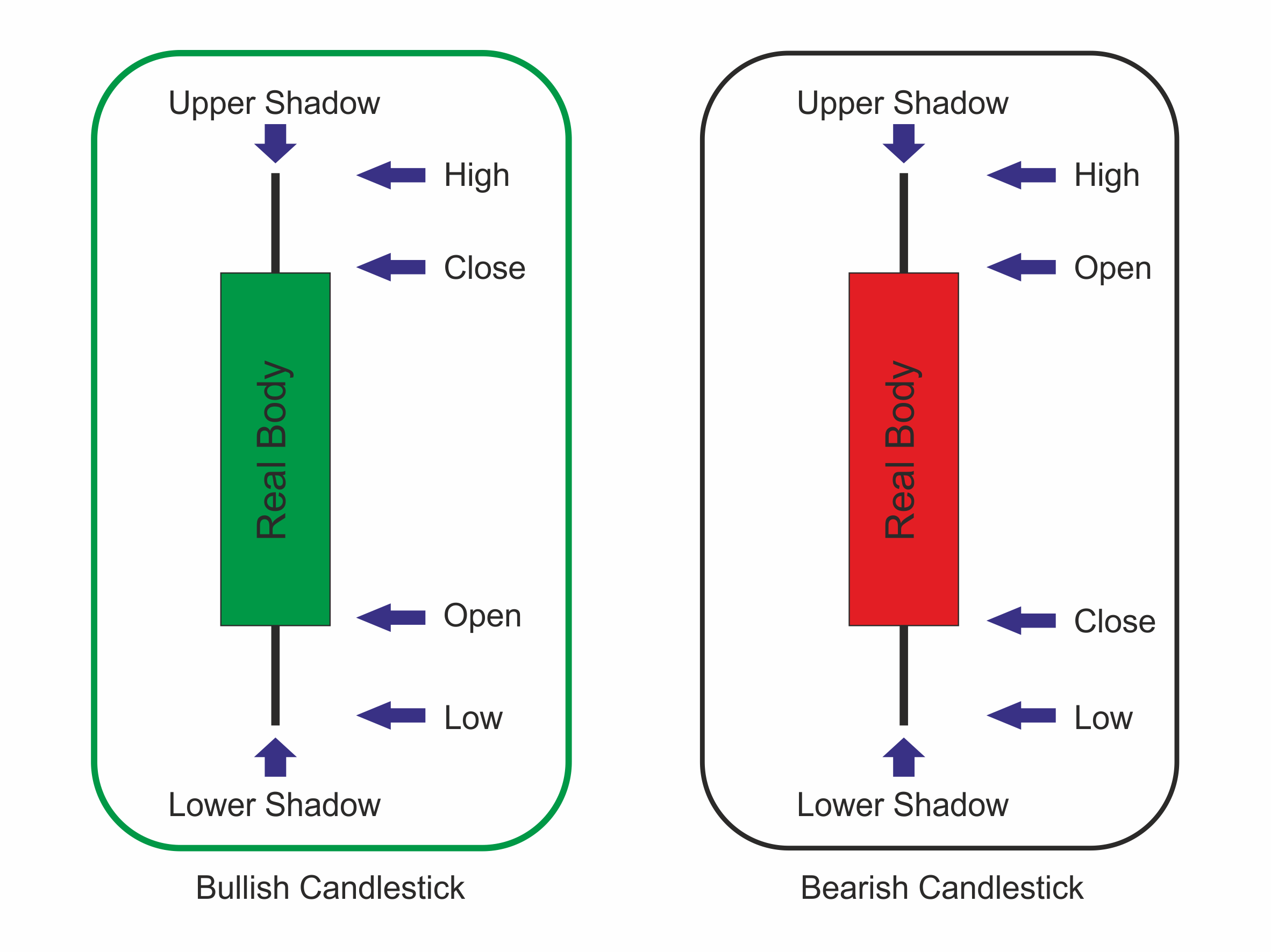 Figure 33 Candle Construction
Tip: The advantage of candlestick charts is the ability to highlight trend weakness and reversal signals that may not be apparent on a normal bar chart through colour and size. This message is much clearer than with Bar charts. For many traders, this is the only reason they use them. They are clearer.
The Shadow
The shadow (sometimes called the Wick) is the trading range outside of the body. We often refer to a candlestick as having a long shadow.
A long shadow above indicates resistance and rejection.
A long shadow below indicates support and rejection.
No or small shadow indicates little rejection power.
The Body
The colour of the body of the candle represents the relationship of the open and close.
Blue (or white or green) candlestick if the close is higher than the open.
Red (or black) candlestick if the open is higher than the close (i.e. the candlestick is filled).
If there is no body, the open is equal to the close.
A big body shows the market is confident of the move. A small body indicates indecision.
Using candlesticks in trading
The relationship of a candlestick’s body colour and size and the position, length, or absence of shadows compared to another describe the market's short-term psychology in a clear graphical form. By studying these elements, skilled traders can see how they are positioned, how enthusiastic or threatened they are and establish a trading plan around this information.
There are 40+ candlestick patterns. Some are stronger (more reliable) than others. There are four high probability patterns you must know.
The four strongest candlestick patterns
Tip: Of the many candlesticks to learn, these four are a must. They have had a high reliability for hundreds of years. They do not work all the time but they work enough times to give an edge in trading. Always protect any position with a Stop Loss. If the pattern works out, its predictive power is normally just 3-5 bars ahead.
In the examples below, grey bodies indicate the body can be any colour, white or black.
Three White Soldiers
Bullish Reversal
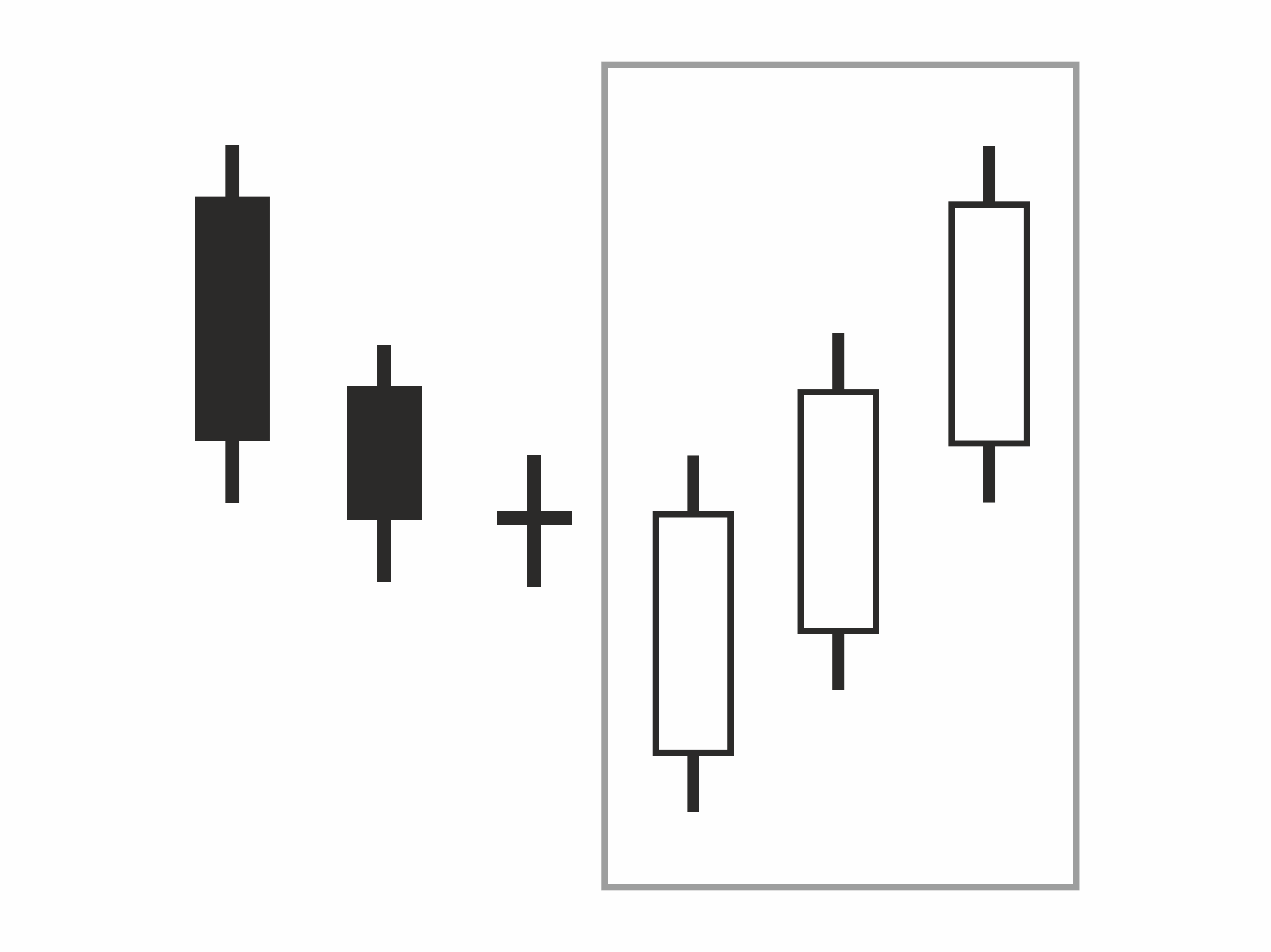 Figure 34 three White Soldiers
The reverse is Three Black Crows
Morning Star
Bullish Reversal
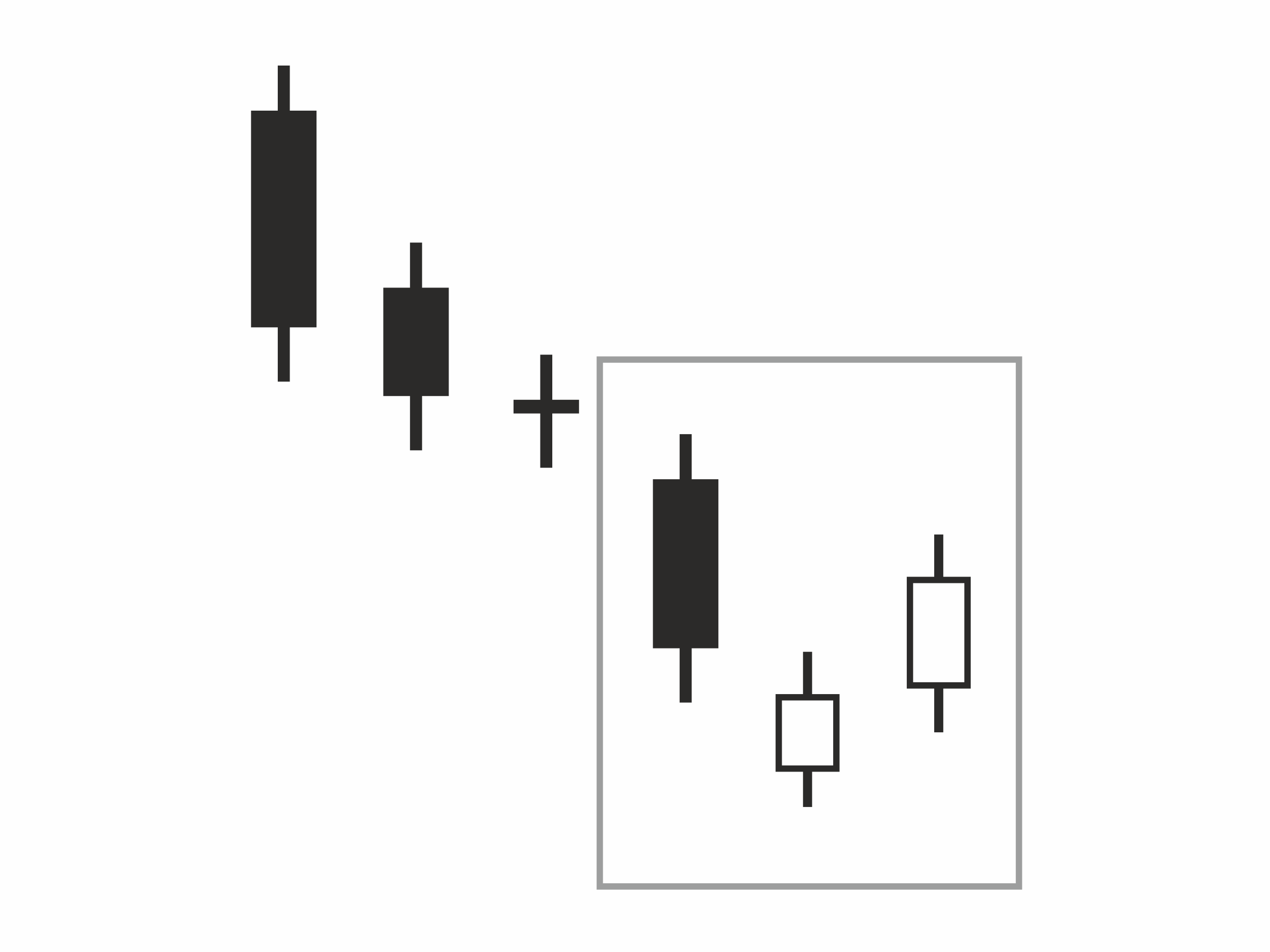 Figure 35 Morning Star
The reverse is Evening Star
Bullish Engulfing Line
Bullish Reversal
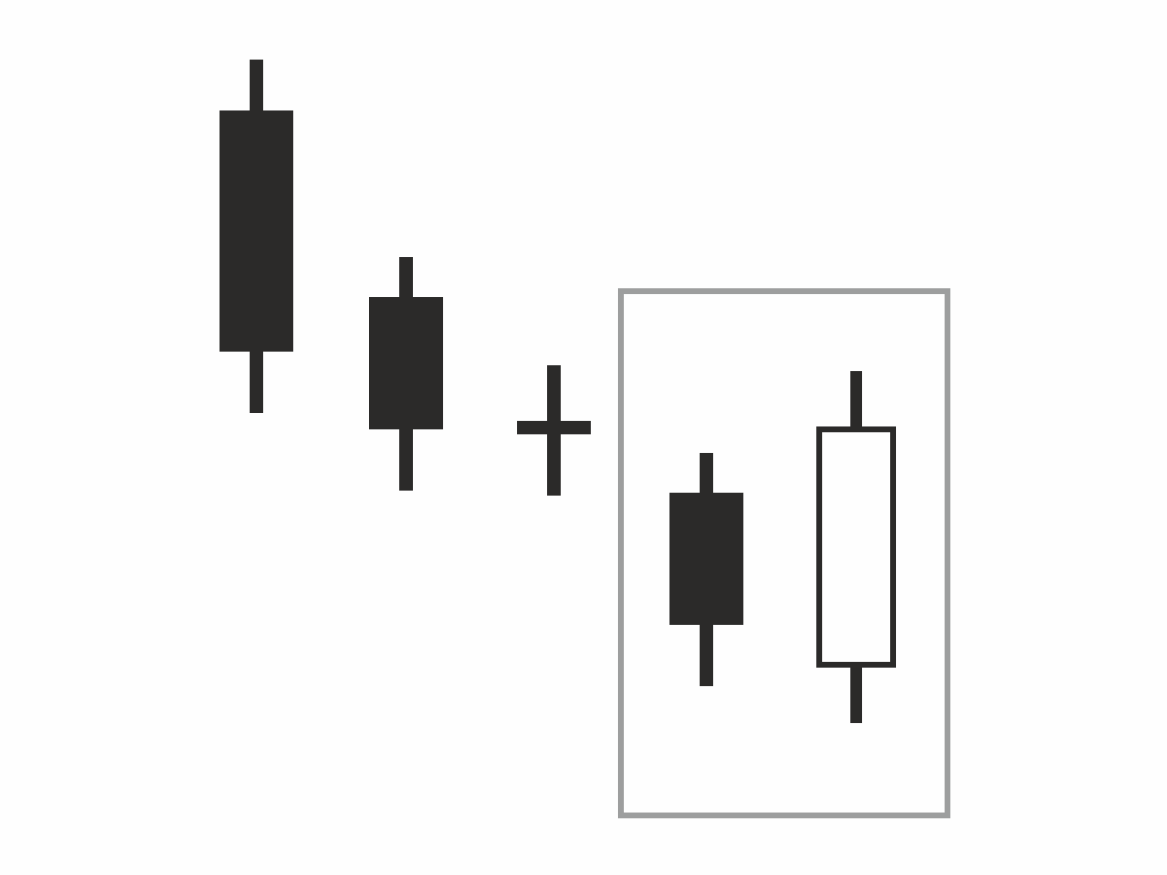 Figure 36 Bullish Engulfing Line
The reverse is Bearish Engulfing Line
Three Line Strike
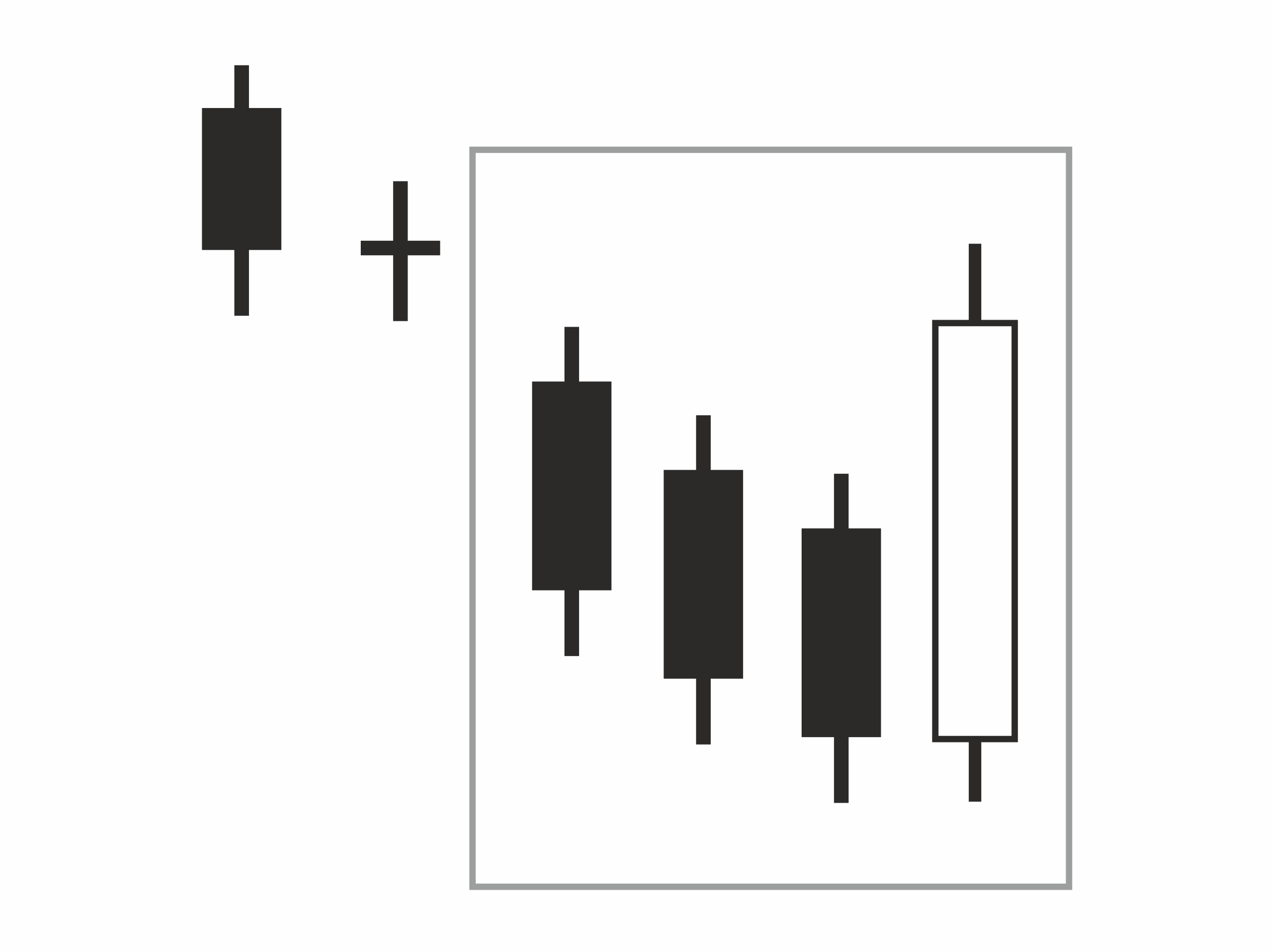 Figure 37 Bullish Three Line Strike
The reverse is Bearish Three Line Strike


